Why it pays to standardize UI terminology and the benefits it brings to your design system.
Why it pays to standardize UI terminology and the benefits it brings to your design system.

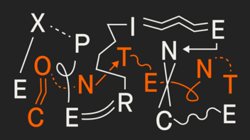
Pop-up, overlay, or modal? Button, btn, or CTA? In our daily work with design systems, we constantly encounter differences in how UI elements are named. Buttons, input fields, pop-ups, and other assets often have different labels depending on the team, individual team members, or stakeholders.
One person might call it a 'highlight button,' while another calls it an 'accent button.' Sometimes it’s capitalized, sometimes abbreviated, sometimes spelled out. The range of naming conventions is wide – even though the functionality is (almost) always the same.

When collaborating with teammates, inconsistent naming may not seem like a big deal. Most terms are fairly familiar, and people usually understand each other. But in design systems, where multiple stakeholders rely on a shared 'single source of truth,' inconsistent terminology can lead to errors, extra work, and lost time.
Take icon handovers, for example: If icons aren’t named properly in the design system, developers need to manually rename each file after export. It’s tedious rework that could easily be avoided with clear conventions from the start.
The same goes for asset searches in Figma. If you search for 'btn' instead of 'button' (or vice versa), you may not find what you need. That slows down the workflow for both the team building the design system and the teams using it in projects.
And then there’s the issue of misunderstandings caused by undefined terms. We experienced this firsthand when it became clear – during a team discussion – that a tooltip and a pop-up tip weren’t the same thing. While visually similar, their behavior differs: a pop-up tip requires manual closing, while a tooltip does not. Without clear naming conventions, issues like this lead to unnecessary discussions, coordination overhead, and avoidable revisions.
We understand the challenges of complex organizational structures, and with a flexible design system, we help you streamline design processes and ensure brand consistency across every channel.
These may sound like minor hiccups, but they cost time – and sometimes nerves. It became increasingly clear: we needed a consistent naming convention.
But the big question was: How do we document it in a way that works for everyone: internal and external designers, developers, stakeholders, and other contributors?
Once we had defined the requirements for our naming guide, the first step was to conduct an audit: we gathered and grouped the most commonly used UI elements, components, and styles. We then expanded this list with all the naming variants we knew of and marked the most common ones as a baseline.
Next, we ran alignment sessions with team members from other disciplines such as UI, UX, and development to agree on a preferred name for each element. These discussions gave us insight into how developers refer to elements in code, which terms are most intuitive across teams, and whether clients had existing preferences. Our goal was to settle on terminology that made sense to everyone and worked across the board.
We then documented our first-choice naming conventions in a Google Sheet, marking all other variants as alternatives. By keeping it online, everyone has real-time access, and it’s easy to edit and duplicate as needed. If a client doesn’t use Google services, we simply export it as a PDF or Excel file and share it with them.
The devil is in the details, and that became clear very quickly. It’s not just about naming individual components. Other aspects also matter and need careful handling:
states: "idle" vs. "default"
Even the states of interactive UI elements require consistent naming. For example, if a button state is labeled 'default' but an input field uses 'idle,' that inconsistency can cause confusion and errors. We standardize on 'default,' since it’s more commonly used and widely understood. During our internal review, it became clear that 'idle' wasn’t familiar to all users, making it less suitable for a shared system.
sizes: “extra-small" vs. "xs"
Just like with states, naming inconsistencies can also occur when it comes to sizes, which can make the search function in a design system less effective. For example, someone searching for 'xs' won’t find components labeled 'extra-small.' We opted for the shorter and more convenient version 'xs', as it’s faster to type and therefore easier to search.
title case vs. lower case
Last but not least, while capitalization has no effect on the search function, a consistent writing style helps avoid errors. This decision was an easy one: since UI terminology is typically in English, we chose all lowercase naming. It’s a clear and practical choice – no one has to second-guess whether something should be capitalized.
We quickly realized that expecting everyone to instantly adopt and apply one shared language 100% consistently just isn’t realistic, or even necessary. What mattered more was raising awareness among all team members of just how valuable consistent UI naming really is.
That awareness sparked more proactive communication. We now address terminology much earlier and more deliberately in team meetings – for example, when clarifying subtle functional differences between components like content switchers, tabs, and segmented controls. Everyone stays aligned, and all decisions are documented.
The naming guide also serves as a practical reference, not just for clarification but also as a valuable onboarding resource for new team members.
Before we start a project like a pattern library, we duplicate and share the file with stakeholders. This gives external development teams a chance to flag any terms they use differently in the codebase. Any deviations are documented in the shared version, so we can ensure that design files, handoff documents, and final code all use the same language.
With this guide, we’ve built a flexible foundation that adapts to each client project. It unifies cross-functional teams, reduces misunderstandings, and cuts down on coordination. Thanks to our naming convention, our design systems are now more intuitive and efficient – and we can confidently say: the time we invested in consistent UI naming was absolutely worth it.

Want to create your own guide for consistent UI terminology? Copy our template and get started!

We’ll get back to you as soon as possible.